Products You May Like
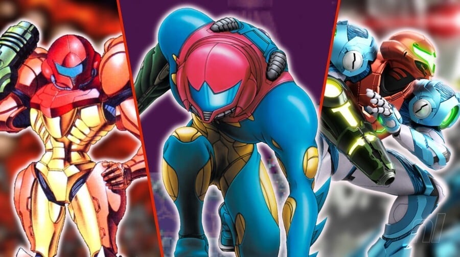
Metroid‘s protagonist, Samus Aran, has a rather unique privilege in the world of Nintendo. Unlike characters like Mario, Link, and Kirby, all of whom retain the same general look across their respective franchises (okay, Link is a little more varied than the other two, but still), Samus’ basic design can be altered quite drastically from game to game.
Granted, the character needs to remain relatively recognisable for fans, so you can’t go nuts with this kind of thing, but when you examine Samus’s overall suit design in each of the mainline Metroid games, it’s surprisingly different in a lot of ways.
So, to loosely coincide with the 20th anniversary of Metroid Fusion in Japan, we thought it would be neat to rank our picks for the best default suits in the Metroid franchise. To be clear, we’re not including every single suit from every single game; we’re just looking at the basic, default design she sports on the front of each box. So, no Gravity Suits, Light Suits, or Phazon Suits. Maybe in the future though — let us know if you’re interested and we’ll see!
For now, though, let’s dive into our ranking for the best default or ‘starter’ suit designs in the Metroid franchise, starting with the ‘worst’…
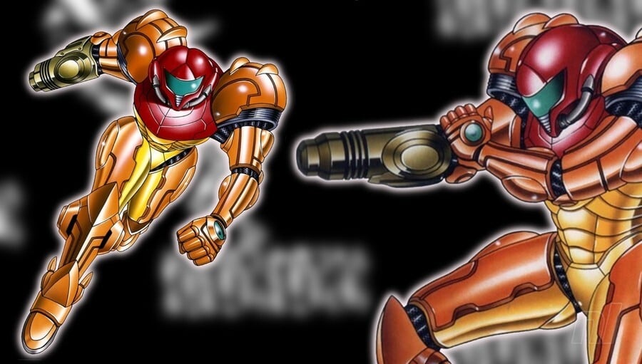
Let’s be clear right from the start: there are no bad suit designs in Metroid. Metroid II just happens to be our least favourite of the bunch. It’s very much the “classic” design, with huge shoulder pads and an almost skeletal look to the suit’s torso area. Now obviously, as with the first game in the series, the smaller details don’t translate into the actual gameplay itself, with Samus reduced to little more than a mess of pixels, but the intention is certainly there.
We’re not particularly keen on how indented Samus’ helmet is here, however. It just looks weird, right? Almost like the helmet has been made up of separate pieces glued together. Not nice. The proportions are also slightly off, but that’s more a result of the art style utilised here. Good effort.
[Good work not mentioning that the helmet looks like a bum, Ollie. Hang on, this isn’t Slack… – Ed.]
#7 – The Birth of an Icon: Metroid
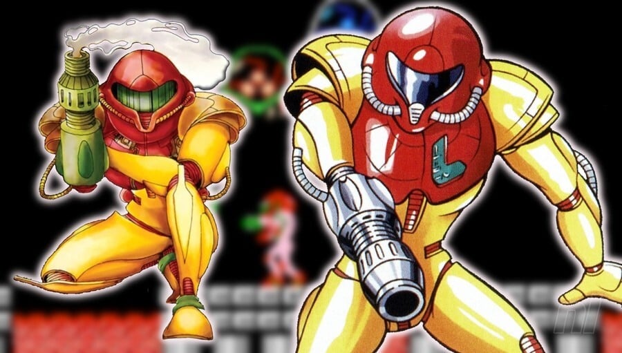
It cannot be overstated just how much Nintendo nailed the design for Samus with its first effort in Metroid for the Famicom/NES. The overall look is based on the Chozo Suit (or ‘Power’ Suit) design, which features as Samus’ base suit in several franchise entries, so it’s lacking those iconic shoulder pads that make the other suits stand out so much.
Nevertheless, the design here is awesome, and in some ways quite alien when compared directly to the others. It’s also a lot lighter in colour, though this could simply be an artistic choice for the concept art. Again, little of this translates well into the game itself, but the overall look is depicted with more success in the 2004 remake, Metroid: Zero Mission.
#6 – Beautiful and Powerful: Super Metroid
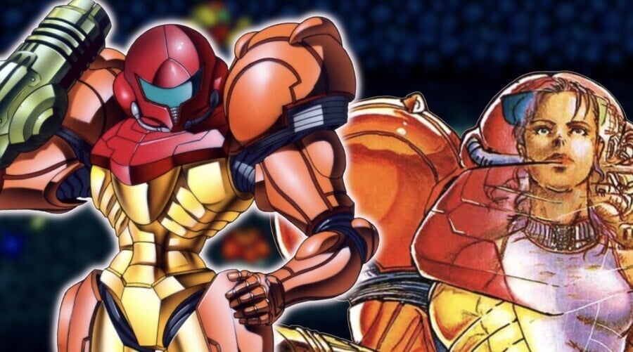
Samus’ suit design in Super Metroid is more or less identical to that of Metroid II: Return of Samus. So why does it rank higher? Well, we think it just looks better, okay? The distracting indent in the helmet [Ahem. What? Sorry, must have missed that bit. Moving on… – Ed.] is now gone, leaving a completely smooth surface on our bounty hunter’s noggin, which is a good start.
Additionally, the suit just looks a lot more imposing, almost like Samus has been hitting those deadlifts in the gym. We’re also a fan of the more muted colour palette used here. Overall, a great look for a great game.
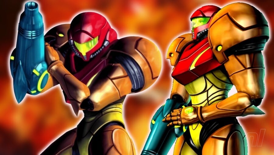
While Other M is certainly a divisive game amongst fans, there’s no denying that Samus looks like an absolute badass. Her suit here is a lot sleeker in its design compared to other games, and that’s probably due in large part to the lack of any fancy bumps and ridges on those iconic shoulder pads.
Samus’ helmet visor also adds a good burst of green colour to the overall look, too, something that many of the other designs are missing, and something which makes the box art — especially the gorgeous Japanese version — really pop.
Indeed, this suit must have been quite popular in Nintendo, as it was subsequently used for Samus’ appearance in the Super Smash Bros. franchise, so there you go!
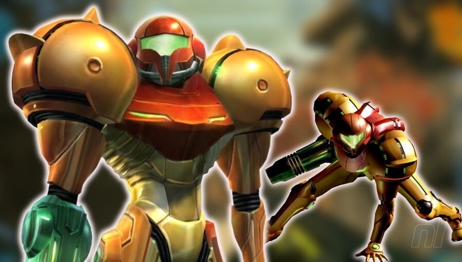
Retro Studio’s more realistic take on the Metroid franchise required a more realistic suit (well, sorta) for Samus, though almost no artistic sacrifices have been made in the process of filling out the suit.
Given the immense popularity of the Prime sub-series, this design is probably the one most fans are familiar with, and for good reason, too. The shoulder pads with the pointed ridges, the helmet, the colour; everything screams Metroid, and it’s simply an iconic look for Samus.
You can also just about see Samus’ face and eyes in the game too, which naturally brings out a nice human element.
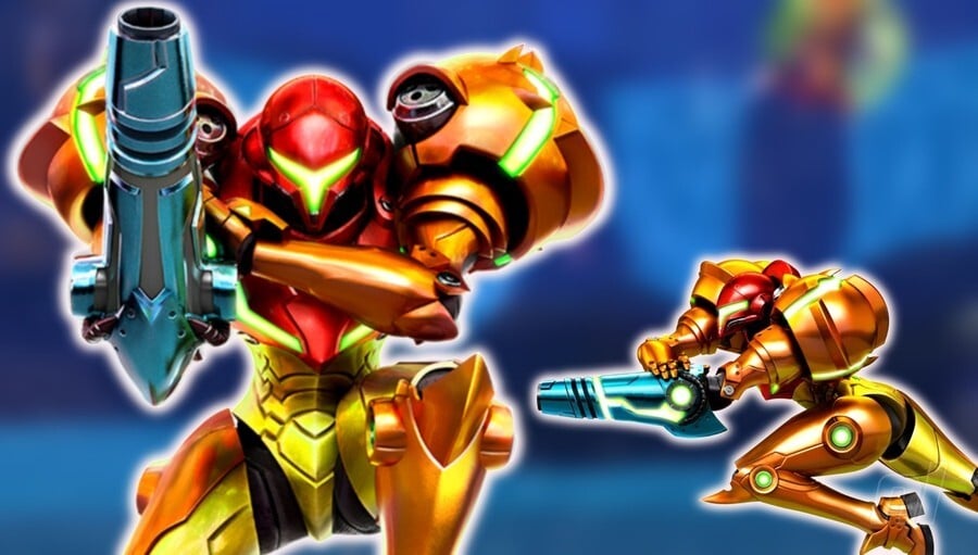
Yes, we hear you: why include the remake of Metroid II as its own entry and not the remake of the first game? Well, because the suit in Zero Mission was virtually identical to the original. The suit in Samus Returns, however, is a drastic departure from the Game Boy version, taking on a more daring, abstract, pointier approach. The shoulder pads here are ruddy huge and they do a great job of making Samus look even more imposing than usual. Must be a nightmare when you’re trying to back out of the driveway or check your blindspot while passing some fool on the drive into work. But they sure look the absolute business.
Not only that, but the way that the helmet’s visor has been slimmed down to near-Mandalorian proportions makes Samus look a lot more menacing than we’re perhaps used to. It’s such a cool look, and the overall approach would be replicated in Dread. But more on that later.
#2 – Mmm, Delicious Parasite: Metroid Fusion
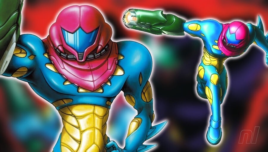
Metroid Fusion has the honour of depicting the most unique suit in the franchise’s history, and this is of course a result of the X parasite infecting our favourite bounty hunter while on the planet SR388.
Although most of her suit had been removed post-infection, parts of the X parasite had effectively fused with Samus’ body, thus creating this sleek, insectoid, and organically beautiful design for the game.
It’s such a colourful suit and really stands out from the crowd as a result. One minor negative is that we’ve got that weird indent in the helmet again, but this isn’t anywhere near as egregious as the suit seen in Metroid II. It looks more like a beetle’s carapace here rather than… anything else.
#1 – The Best of the Best: Metroid Dread
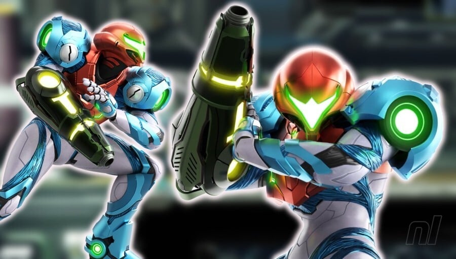
Samus’ suit in Metroid Dread is beautiful. Absolutely beautiful.
It’s a wonderful blend of the more mechanised suits we’re used to from the series with the more organic approach taken in Metroid Fusion. It keeps some of the more unique colours from Fusion while adding some flair of its own, with shots of white and green to mix things up spectacularly.
Another thing to note is that Samus’ helmet visor is once again slimmed down, similar to Metroid: Samus Returns, with an added indent at the top giving a slightly avian feel to the helmet. It’s such a cool artistic touch and it’s one we hope to see continued in the franchise going forwards. Overall, a wonderful effort from developer MercurySteam.
So there you go, those are our personal rankings of Samus’ default suits in the Metroid franchise. Do you agree with our picks? Probably not, let’s be fair. Good news, then, you can vote for your favourite suit in the below poll. If you’re so inclined, be sure to include your own ranking in the comments section, too. While you’re at it, let us know what you think Samus should look like in Metroid Prime 4.
