Products You May Like
With Moving Out 2 coming to PS4 and PS5 just a day away, we thought it would be interesting to go through some of the big additions we made to the game, how we carried across the inclusiveness and diversity from the first game and talk about how our design process enabled that.
The biggest request we had from Moving Out was for online multiplayer and we’re very proud to say that in Moving Out 2, players from all over the world play together with cross-play! We had to rewrite the game engine and core physics completely but now there’s no excuse to jump in and start yelling PIVOT! at your friends.
We didn’t just stop at online multiplayer, either. The size of the game is also 2x the original, with over 50 levels across five different dimensions.
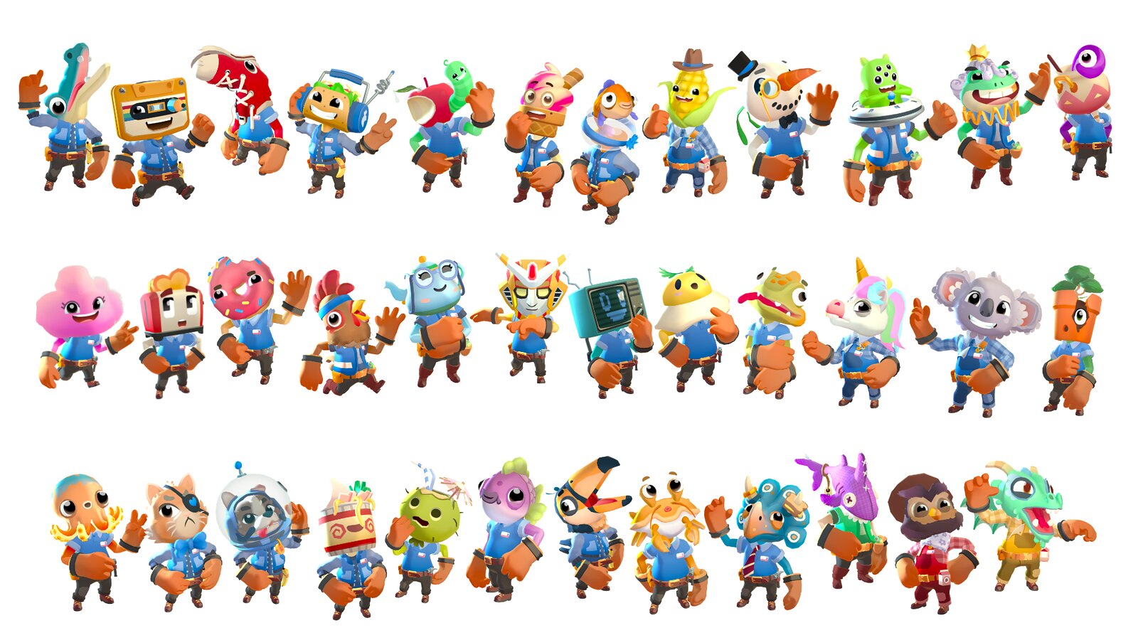
The new Smooth Moves employees
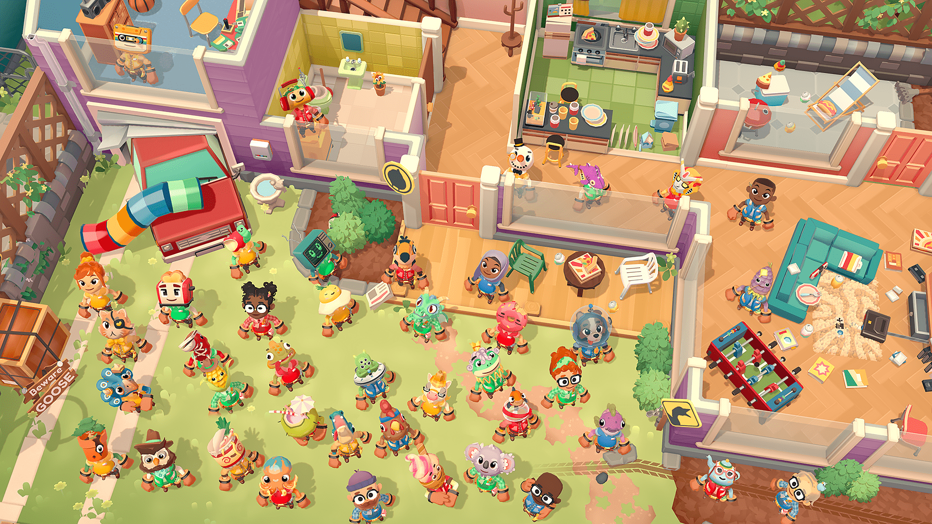
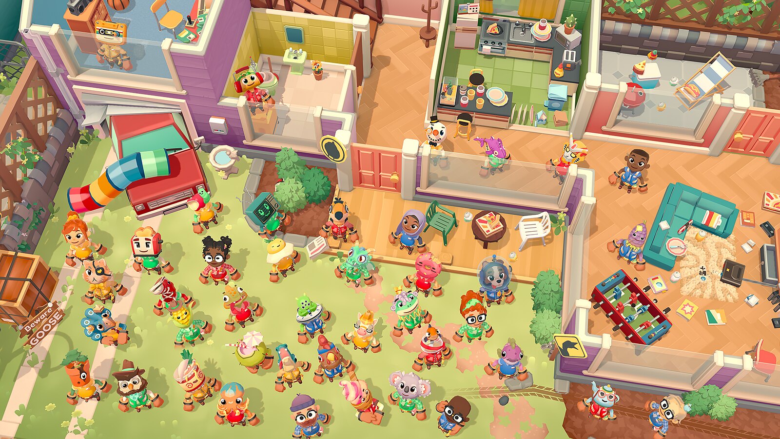
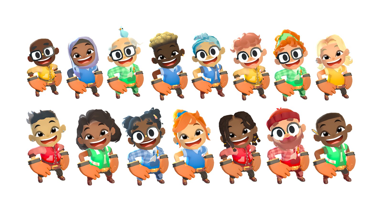
We’ve also introduced a whole new diverse cast of movers to play, plus we’ve brought back everyone from the first game as findable movers in the world. That’s a total of 38 different characters to choose from, each with two additional costumes to unlock.
We made sure to bring back the very popular feature of having any character represented in a wheelchair. Our main movers are joined by Mel (Melbourne is where the game was made) who joins Sidney (Sydney is where SMG’s HQ is) as the main human characters on our box art. Even for the non-humans we thought it was important to have a large variety of gender neutral characters which were representative of our art team and the greater shift culturally.
Finding the fun while making it accessible
When it comes to designing games, SMG is very mechanics driven and design-led. We start with ideas for interesting ways to play and then find the gameplay from that. We always keep in mind accessibility and approachability to the levels and the game itself. A game isn’t fun if some people can’t play it.
Moving Out 2 is a very silly game that is driven from the core mechanics of moving items in fun ways from A to B. We had a lot of fun creating it but that fun comes from a lot of thought and testing. As designers, we feel lucky to work on Moving Out 2 because it’s essentially a sandbox for us to experiment and play around with. We spent the first few months “finding the fun” by introducing new ideas and mechanics and seeing how they felt in this silly sandbox. We wanted Moving Out 2 to be a true sequel and progression and being able to spend that extra time exploring and evolving new mechanics was extremely beneficial. You never know when an idea on paper will work and how the multiple ideas combined will interact and create new emergent fun ways to play.
While creating new game mechanics is an interesting design challenge, we needed to make sure that they ticked the boxes for a Moving Out game. Does it add anything new to the experience? Does it make the players communicate more? Does it fit the Moving Out “grab & move” gameplay? Can it be used in multiple ways and more importantly, is it actually fun?
A lot of ideas sound fun on paper but might not work in execution. One idea we left on the cutting room floor was a hamster wheel. One player would need to run inside a hamster wheel while another player would perform a task being affected by the wheel’s movement. This sounded great initially but in playtesting (we playtested Moving Out 2 over 200 times with external players and was testing after only a few months into development), we found that one player running in place was boring for them, they’d stay in that area most of the level. Although it didn’t make it in, it was important for us to stress test via external playtesting and make sure it didn’t fit. It didn’t tick the “fun” box so we moved on.
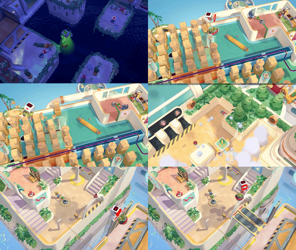
A new mechanic that did make the final game was our controllable drones. At first we created the drone itself which is controlled by a player holding a lever in game. From there we looked at how we can have it interact with our existing mechanics. We added grab handles so one player can grab onto the drone and another player can carry them around the map. You know a mechanic is going to work when just playing around in the sandbox you’re having a good time. We used this in a way where the players will have to take turns either controlling the drone or grabbing onto it.
We expanded on the drones by creating one that would smash and break parts of the environment. We already had breakable pieces of the environment so matching these two mechanics to make a wrecking ball drone turned out to be very fun. All of these different drone interactions used the same input mechanism, so it allowed us to create new experiences without needing to teach completely new mechanics to the players.
We also have clouds in MO2 where clouds cover parts of the level and the players must use a vacuum to suck them up to make it easier to see parts of the level. Attaching one of these vacuums to a drone gave us a new way to interact with the clouds.
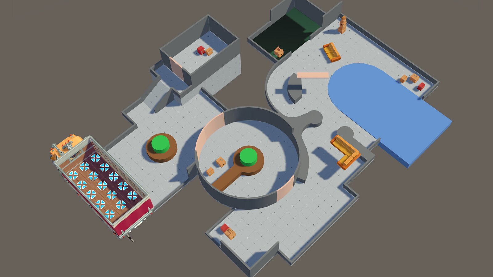
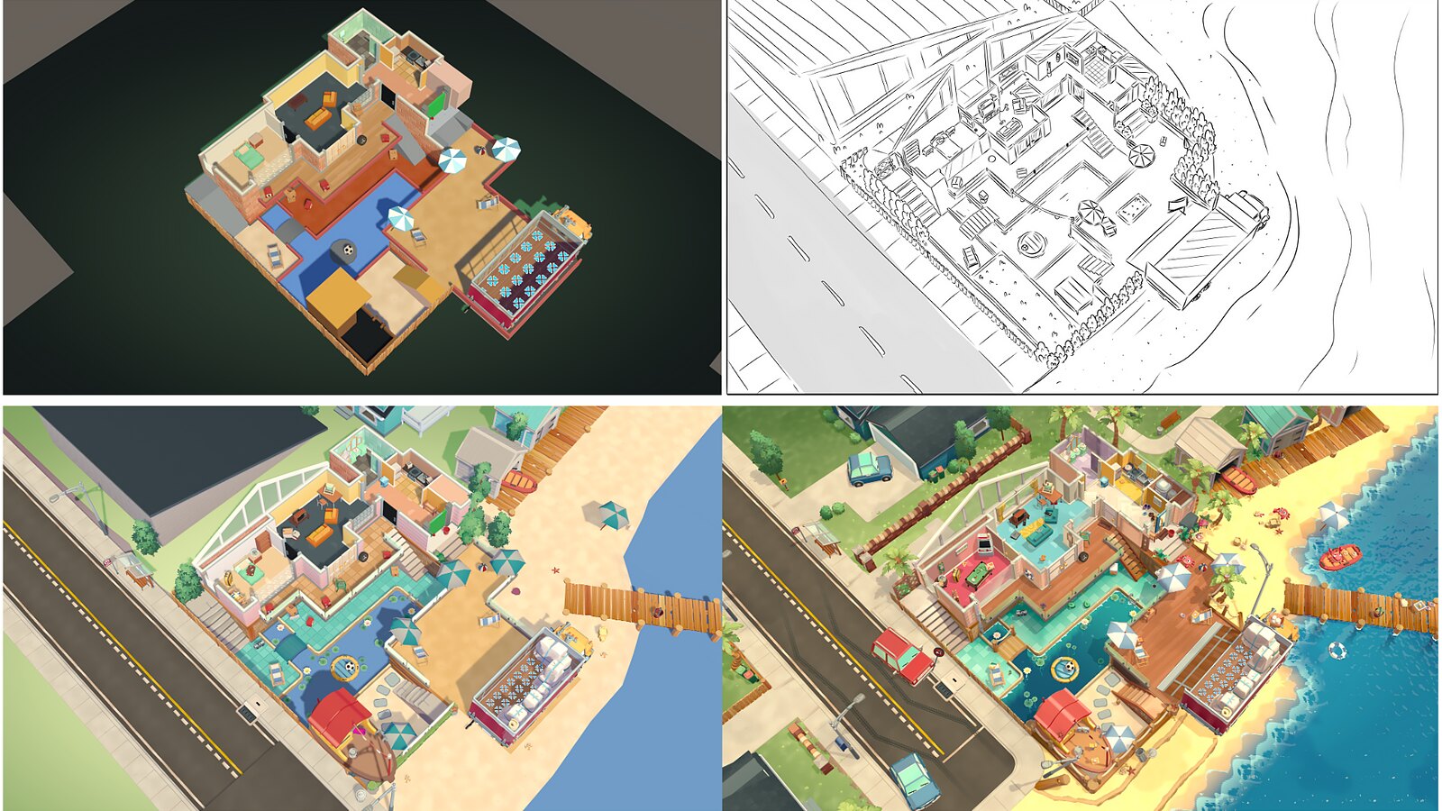
Our level building process goes through many phases too. Depending on the idea, sometimes we sketch out levels but the majority of the time we just head straight into the engine and use ProBuilder to start feeling out what we find is fun. We often create sandboxes with a lot of mini interactions we find fun and then from there we go about putting those interactions together into a final level. These interactions are created with primitive shapes such as cubes and spheres and are called greyboxes because they contain no art assets.
Once we have a greybox we are happy with we then playtest it (internally and externally) to make sure the goals and ideas of the level are easily recognizable by players even with the primitive shapes. There’s people who have playtested for us the entire game but only in greybox form! If your game is fun to play in greybox form then you can be confident to move onto the next stage.
Even in this early stage, from an accessibility standpoint, it’s very important to us that we not rely solely on color or text to communicate the goals of the level to the player. We want the game to be as global as possible, so we use level design and environmental cues. We found this out the hard way when using the word ‘chooks’ in early playtesting (means chickens here in Australia) and our non-Aussie testers couldn’t understand what it meant.
Depending on how playtesting went, a level might require some tweaks and changes in order to make it through to the next design phase. Once it passes initial playtesting, the level gets greenlit and is then sent over to the art team for some concept art. After the concept is approved by both the art and design teams, we can start implementing the art assets themselves. It doesn’t stop there though and the level is once again playtested and depending on how that goes, usually will require further tweaks from the art and design team.
Expanding on the accessibility of MO1, all the levels in Moving Out 2 allow for “Assist Mode” to be toggled on and off at any time, without changing your progress. Players can enable additional time, remove items when delivered, skip levels if they fail alongside more subtle changes like reducing dangers. This Assist Mode, along with adjustments to the game’s UI, non linear level progression and remappable controls, make the game much more accessible to all players.
We’re proud of Moving Out 2 and hope this gives some insight into the work involved in bringing the game to life. If you have any further questions we’ll be sure to jump into the comments to answer them as best we can. See you all in Packmore!
