Products You May Like

It’s hard to believe that it’s been 20 years since the Nintendo DS launched, yet here we are. It’s been even longer since it was revealed too, with the newly-appointed VP of sales and marketing Reggie Fils-Aimé taking to the stage at E3 2004 to showcase Nintendo’s vision for the future of handheld gaming.
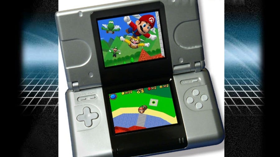
We know now, of course, that the console clutched in Reggie’s hands was a mere prototype. At the time, however, as far as many prospective customers were concerned, this was it. This was going to be the Nintendo DS that would wind up in millions of homes across the globe.
As such, many weren’t too keen on the look of the device, with Reggie himself stating that “people perceived the design to be clunky and cheap” in his memoir, Disrupting the Game. It didn’t help that Sony had revealed the PSP the same year, and with its large, glossy, single-screen design it was instantly perceived as a classy, premium product.
But was the DS prototype really so ugly? In this humble writer’s opinion, no, it wasn’t.
Let me elaborate. Although I was aware of the GameCube prior to its release, the Nintendo DS was really the first system that I’d followed closely from its initial reveal right up until to launch. When I saw Reggie with it at E3, I was so blown away by the concept that the design of the thing took a backseat. But I can’t recall any thoughts of it being ugly; I was too excited to get my hands on it and play the darn thing.
I do recall seeing the redesign that would go on to become the official launch unit and thinking, ‘Oof, yes, that’s definitely nicer’ (and there’s no doubt in my mind that Nintendo eventually nailed the design with the unquestionably sexier DS Lite), but there’s something about the prototype unit that still really speaks to me. It looks like the kind of thing you’d see in a sci-fi movie from the ’60s and ’70s; a proper chunky boy with smooth, plastic casing, curves in all the right places, and an intriguing black strip surrounding the iconic dual screens. Indeed, it wouldn’t look out of place aboard the USCSS Nostromo.
That’s what I think, anyway. But what about you? Do you think the DS prototype is ugly? Was Nintendo right to redesign it? Let us know by voting in the poll below and elaborating with a comment.
