Products You May Like

Ahoy everyone, welcome back to another Box Art Brawl! We’ve got a great one for you this week, just in case the image and the title didn’t quite give it away.
Last week, we looked at Mario Golf (which is out now on Nintendo Switch Online + Expansion Pass!), pitting North America against Japan to determine which box art design is better. The more ‘classic’ design of the North American box art came out on top, taking in 67% of the vote. It seems the more ‘artsy’ approach for the Japanese version didn’t quite resonate with readers, and we totally get it!
This week, to celebrate the 30th Anniversary of The Legend of Zelda: A Link to the Past in North America, we’ll be looking at how the region’s box art design stacks up against Japan’s. We won’t be including Europe on this occasion, because its box art is so similar to NA’s, it doesn’t really warrant looking at as a separate entity.
Be sure to cast your votes in the poll below; but first, let’s check out the box art designs themselves.
North America

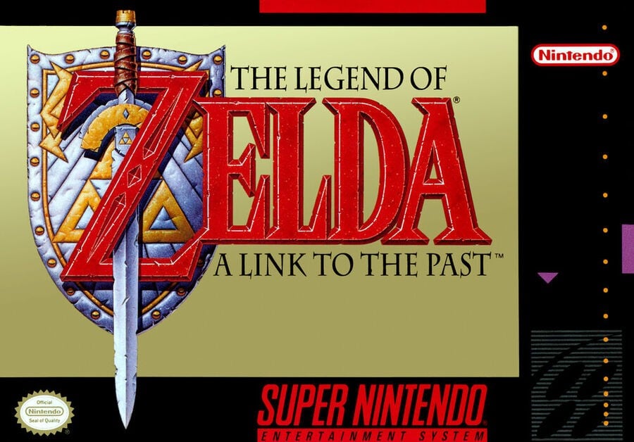
The North American box art for A Link to the Past is very classy. There’s just something about that gold background, right? It’s an aesthetic that’s been prevalent with Zelda box arts since the very first game on the NES, and although it’s dropped off a bit with later titles, we don’t think anyone would complain if Nintendo used the same design for every mainline Zelda title. It just works.
This also happens to be the first game in the series to feature a sword piercing through the letter ‘Z’ in the Zelda title, a design choice that returned in Link’s Awakening and – to a lesser extent – Ocarina of Time, before taking a vacation until 2017’s Breath of the Wild. Again, this feels like vintage Zelda, and we love it!
Japan

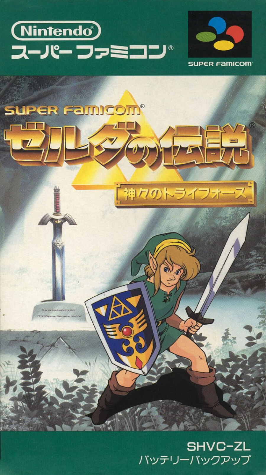
Japan’s box art follows the general tone of the NES Zelda games from the region, with a beautiful drawing of Link in a typical action pose against a backdrop of The Lost Woods. The Master Sword can be clearly seen in the background, lit up by gorgeous sunbeams. It’s the polar opposite of the NA box art, but arguably does just as good of a job at depicting what the Zelda series is all about.
The logo itself is also absolutely stunning. The gold metallic lettering against a striking image of the Triforce is iconic in an entirely different way to the NA version. It’s something we haven’t really seen again since, as Japan’s logo design is more or less on par with other regions.
Overall, it’s certainly a nicer looking design, in our eyes, but does it trump the classic gold aesthetic of the NA box? Hmm, not sure…
Thanks for voting! We’ll see you next time for another round of the Box Art Brawl.
