Products You May Like
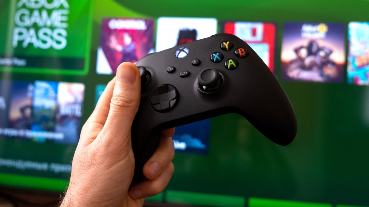
Microsoft has unveiled an all-new Xbox Series X|S dashboard layout overhaul, and it seems like it’s finally nailed it.
The latest Xbox Series X|S dashboard layout is currently in the testing phase. Right now, it’s only available to Xbox Insiders on the Alpha rings. But if you want to see it for yourself early, here’s how to sign up to the Xbox Insider program. And you may want to, as there’s no concrete date for when the new layout will roll out to the install base at large.
Some big changes have improved the dashboard experience significantly. You can now easily access the Microsoft Store, Xbox Game Pass, search functions, the settings menu and more via dedicated shortcut icons at the top of the screen. Much more real estate has been given to your dashboard’s background image, and it’ll even change based on the game you’ve currently got highlighted. That’s quite similar to PS5‘s dashboard and should help it feel more personal and eye-catching.
The ‘My games & apps’ icon has also undergone significant changes. It’ll now alert you to things like new games and updates. The art displayed on the tab also seems to represent four games you have installed, or ones that potentially need an update. It’s a nice aesthetic and practical overhaul, all round.
A much-needed change

Xbox likely wasn’t deaf to the criticisms of the Xbox Series X and Xbox Series S‘s current dashboard layout. The home menu is cluttered with icons that both obscure the background image but, more detrimentally, are disorganized and have a habit of jumping around.
The inclusion of homepage ads that are likely irrelevant to the end user also feels tacked on, like they’re just taking up space for the sake of it. Thankfully, the new layout looks to point players to more relevant things, such as a highlighted Xbox Game Pass title or a section for the Xbox Elite Series 2 controller.
Xbox’s new layout does look to have taken some inspiration from Sony here, with a wider format that displays a more organized list of game icons. At a glance, I immediately see the games I’ve been playing recently (which should work wonders for the excellent Quick Resume feature).
Not only that, but quick access to Xbox Game Pass and My Games & Apps is a welcome change, especially if they’re locked in the same position on the dash. With all that to look forward to, I think this latest dashboard layout can’t arrive soon enough. Let’s just hope it gets thorough testing from Xbox Insiders before it’s ready for prime time.
