Products You May Like

It’s time for another edition of Box Art Brawl — let’s get ready to rumbllllllle!
Before we get into this week’s match-up, let’s see how things panned out last time. We took a look at the GameCube’s Donkey Konga, with a whopping three different designs to choose between. It was the Japan cover that walked away with the win, however, taking 48% of the vote, closely followed by Europe with 40% while North America brought up the rear with 13%.
This time we are leaping ahead through Nintendo’s console history as we tackle Mario & Luigi: Superstar Saga + Bowser’s Minions for the 3DS. Frankly, we’re in something of a Mario RPG mood at the moment and this slick remaster is one of the late-life 3DS titles that we would love to see make the jump over to the equally late-life Switch — go on, Nintendo, you know you want to…
There are two different covers for us to take a look at this time, with North America and Japan both opting for very similar designs. This means that we have a good old-fashioned duel on our hands.
So, let’s-a go!
Be sure to cast your votes in the poll below; but first, let’s check out the box art designs themselves.
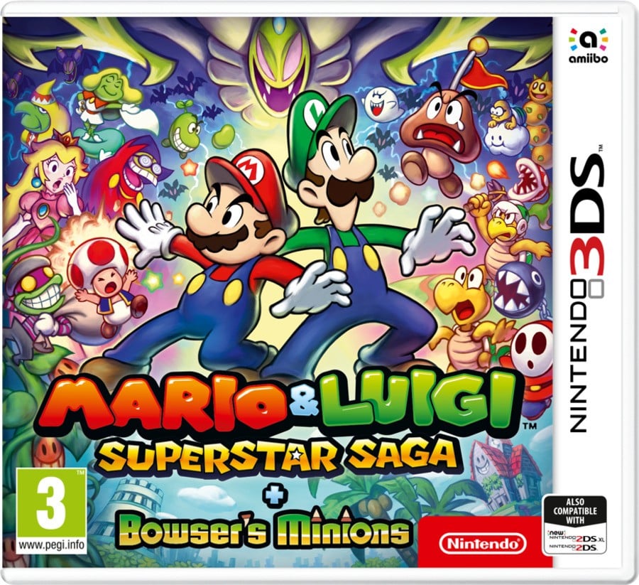
Europe

We’ll admit, the European cover has a lot going on, but we’d be lying if we said that we didn’t like it. The central bros. look sufficiently stressed out, and the hoards of enemies and allies that surround them give a taste of just how many different challenges there are going to be ahead. We’re particularly fond of Cackletta’s placement directly above our titular heroes — talk about imposing.
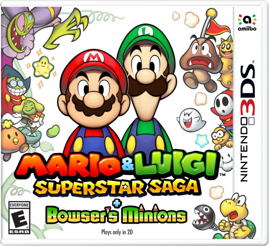
North America / Japan

By comparison, the North American and Japanese designs opt for a much more stripped-back approach. Far fewer characters are packed in around the edge of the frame and the gloomy background of the EU cover is replaced by a pure white. That’s not to mention Mario and Luigi themselves, who have changed from the ready-for-action pose to something much more docile — they’re just happy to be there. This lighter design is presenting a very different game indeed.
Thanks for voting! We’ll see you next time for another round of the Box Art Brawl.


