Products You May Like

Are you sitting comfortably? Ready to judge some classic covers? It’s time to dive into another edition of Box Art Brawl!
Last time, we matched up three different designs for Super R-Type. Despite a good variety between each, it was the North American variant that walked away with the win, taking 49% of the vote and leaving Europe and Japan with the remaining 30% and 25% respectively.
This week, we’re asking for your Pika the bunch as we look at the regional covers for Pokémon Colosseum on the GameCube. This one had everything a Pokémon fan could have asked for back in 2004. 3D models! Darker tone! Nicking Trainer’s ‘mon! Sure, it might look a bit shonky by today’s standards, but that’s nostalgia goggles for you.
With Europe, North America and Japan each opting for a different design, we have three unique covers for you to choose from this week. So, let’s catch ’em all…
Be sure to cast your votes in the poll below; but first, let’s check out the box art designs themselves.
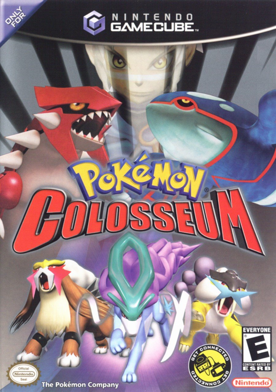
North America

Now, how cool does this look? The dark North American cover is all about the legendary Pokémon, with Groudon, Kyogre, Raikou, Entei and Suicune taking centre stage. It’s also one of the rare instances where a Pokémon Trainer makes it to the cover, as game protagonist Wes looms in the background.
It’s simple, but it’s rather effective too.
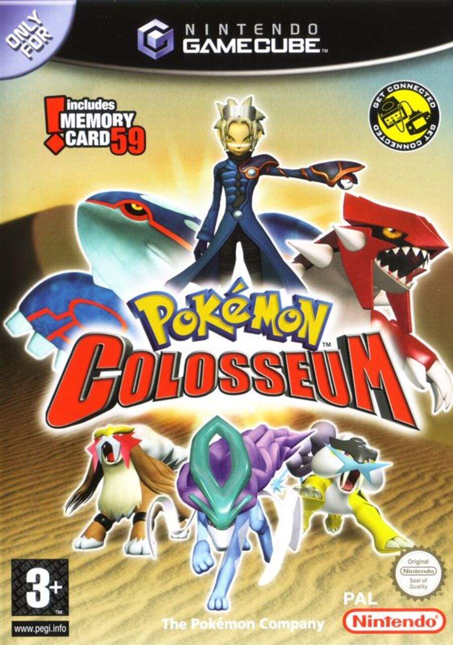
Europe

Now this is interesting. The European cover has all the same components as its NA counterpart but arranged completely differently. Wes takes a far more prominent role here, standing alongside the legendaries as the central focal point. The gloomy black has also been substituted for a brighter gold backdrop, with a sandy desert taking up the lower portion of the design. There’s certainly a lot more to take in here.
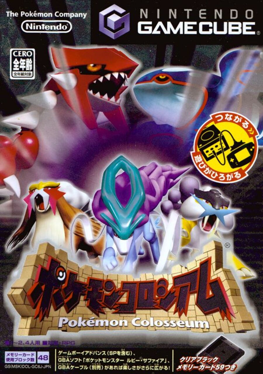
Japan

The Japanese design does away with Wes completely, pushing the game title to the bottom so the legendaries have their space to shine. It’s a far more Pokémon-centric take, and it’s also the only one that addresses the ‘colosseum’ of the title, with the walled backdrop wrapping around the name text.
Thanks for voting! We’ll see you next time for another round of Box Art Brawl.


